(NOTE: This was not
an Algonquin course assignment, but, rather, one of my personal projects.)
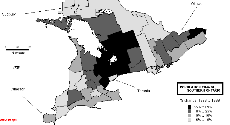
Monochrome maps constitute a challenge over coloured maps -- colours tend to dazzle the eye, so even if the information being presented is somewhat uninteresting, one is able to "sell the sizzle, rather than the steak", and capture the viewer's attention much easier.
Using monochrome, though,
prevents one from "hiding" behind the packaging of the map. The map
below is simply an illustration of how the monochrome (ie: "black-and-white")
palette is an alternative to colour. In fact, sometimes it is a refreshing
change to use monochrome, since a colour map can become too overwhelming
if the palette is extensive and considerable other information is being
shown:
Other considerations when deciding on using monochrome are:
- file size -- monochrome lends itself to 4-bit rather than 8-bit GIFs, and
- photocopying -- not everybody has access to colour photocopiers!
Your comments on these maps are welcome!