(NOTE: This was not
an Algonquin course assignment, but, rather, one of my personal projects.)
One of the most controversial political issues in the recent past in the Ottawa area has been that of school closures. Orleans, a suburb of approximately 100,000 people east of Ottawa, has not been immune to the debate, even though it is a relatively young and rapidly growing area, where one would expect that the need for new schools is obvious, and the pressure to close existing schools is minimal.
However, even within Orleans,
there are significant shifts in the population of school-age children that,
given the size of the suburb, may necessitate considerations of school
closure as much as in older, more established areas of the Region.
If not, the Board of Education will have to give serious thought to increased
levels of bussing in order to more efficiently use the excess capacity
that will occur in existing schools.
Methodology:
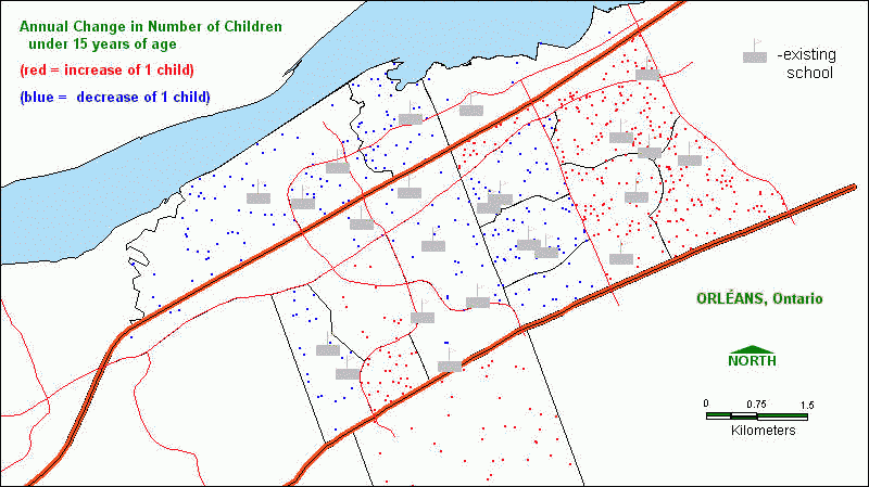
Thematic mapping and SQL ("structured query language") can be used to isolate where in Orleans the problems with school capacity may occur.
Census tract data from the 1991 and 1996 Census were analysed using SQL in MapInfo. The same exercise can be replicated in ArcView. Census tracts where the population of elementary (<15 years of age) school children increased from 1991-96 were separated from those where it decreased, resulting in 2 query files. Each of these 2 files were then separately mapped to show change in population, either increasing or decreasing, by a dot-map. That is, rather than a series of colours to indicated category of change (eg: high/medium/low, as in the US population map), the actual change is depicted where each dot represents a certain number of people.
The 2 separate thematic maps were then combined into one. The result indicates those neighbourhoods (census tracts) where the number of children is increasing, in red dots, and those where the number is decreasing, in blue dots. It is important to note that MapInfo randomly distributes the dots within a particular polygon (ie: census tract), so the exact location of each dot does not necessarily reflect the particular houses where children are moving in or moving out of (lol!).
To finalise the analysis, the locations of existing elementary schools are placed over these 2 thematic maps as another layer, such that the result provides a visual message as to which schools might be facing increased student population, and which might see a decrease. Clearly, it is those schools in the east part of Orleans which will feel increasing pressure. Meanwhile, a number of schools in the northwest area will likely see a fall in student numbers, and may thus become "destination" schools in new bussing patterns.
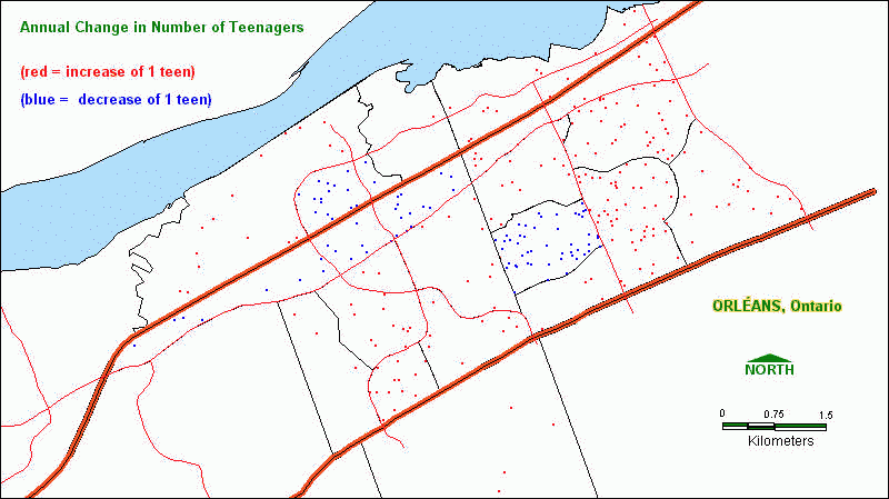
As a footnote, the above analysis was also carried
out with the high school population as well. Again, the two thematic "growth/decline"
maps are overlain to produce the first result,
while the existing high school locations are then added to produce the
final result.
Observations:
Thematic mapping allows one to make rapid conclusions about the geographic distribution of entities that would be very time-consuming dealing only with lists of statistics and addresses. In the case of the first map above, we can quickly count the number of schools located in areas of growth and in areas of decline. 17 schools are located in the "blue dot" areas of declining school-age population, while only 6 are in the "red dot" growth areas.
Furthermore, there is a marked difference in high school population changes compared to those of elementary school students. The neighbourhoods that showed a decline in the population of younger children instead show an increase in the population of older children. Thematic mapping allows this to become apparent quickly, without performing mental calculations; looking simply at columns of data, this observation would not come so readily ("a picture is worth a thousand words").
Additional work will be done to use MapInfo's own overlay functions to mathematically make the above comparison between high school and elementary school population changes. Census tracts meeting certain criteria, that overlap those in other layers based on different selection criteria, can be selected using SQL in much the same manner as outlined in "Methodology" above, on an "object" rather than algebraic basis. This is very similar to Boolean overlay functions in raster GIS.
Your comments on these maps are welcome!