(NOTE: This was not
an Algonquin course assignment, but, rather, one of my personal projects.)
Part 1 - High vs Low Growth
Data from the US Census Bureau for 1990 (most recent decennial) and 1996 (inter-censal estimates) was obtained for over 3,000 counties in the USA. These data are available free of charge on the Web.
The 1996 population is divided by the 1990 population to provide an estimate of recent growth rates, not actual population change (see Part 2 below). Unfortunately, mapping over 3,000 counties provides a resulting map that is somewhat difficult to interpret. As well, many counties register very high growth rates, but are very small in population, leading to misleading comparisons with large urban areas.
As a result, only counties with populations over 100,000 people, in either 1990 or 1996, were plotted. Using MapInfo version 4.5, the thematic algorithm is done in 2 steps. First, a "query" is performed simply to isolate the study area (counties with > 100,000 people), such that:
Click here to see the template of this query. Second, the thematic map itself is generated based on an "expression" in the <Create Thematic Map...> module, and choosing only 2 theme ranges, based on equal count (ie: number of high growth counties equals number of low growth counties), such that:
- if county population is greater than 100,000 then keep, else
- discard.
The result? A clear pattern emerges: growth is highest in the US "hinterland", away from the densely populated Northeast. High growth is occurring in the US south, mountain states and West coast, notwithstanding lower growth right along the coast itself (eg: LA).
- if county is high growth, assign red colour to its polygon, else
- assign green colour.
Conversely, there is a clustering of low-growth areas around metro New York and New England. Low-growth is particularly clustered around the Great Lakes. Exceptions are noted in the Great Lakes basin, however, such as the western suburbs of Chicago and the suburbs of Minneapolis.
Plotting all 3,000+ counties
would not have brought out this pattern so well.
Part 2 - Growth vs Decline
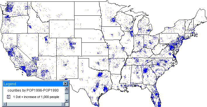
Comparing growing counties to declining counties in the US presents a different mapping challenge, particularly if one is interested in plotting actual amount of population change. One possible method is to plot population change on a "dot map" basis, where 1 dot represents a given number of people. This is quite different from Part 1 above, where one is plotting the results of queries.
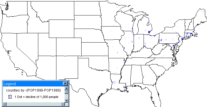
When population growth was plotted at 1 dot equal to 1,000 people (1990-96), the resulting pattern is quite clear. It would then seem logical to overlay on this a map plotting decline at 1 dot = 1,000 people.
Not so. The problem centres around the fact that, while many counties are declining, most are declining by very small amounts; a small number of urban counties, mostly in the Northeast account for the bulk of the total population decline in the entire US. Yet the decline of population in the Great Plains states, while only a small number in each county, is significant in that it constitutes a large unbroken geographic area of rural decline, where sparsely populated regions far from large urban centres are losing the few people they already have. This represents a significant rural issue in America, and needs to brought out in the map.
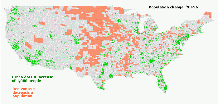
Thus, if one were to plot declining population on a dot basis, the map would be "overwhelmed" by the small number of counties with large declines in the Northeast, while the geographic extent of rural decline in the Great Plains would be masked. Instead, the rural decline was represented simply by showing declining rural counties (and not the amount of decline) in a special colour, while the growing areas were shown, by amount of growth, using the dot map. The result presents a map with an impact much different than simply 2 dot maps. The contentions about the developing of a burgeoning bi-coastal economy in the US, with the Great Plains an enormous rural hinterland being left out of the "new economy", become much clearer.
Your comments on these maps are welcome!